
Tocreaty makes custom handmade crochet. My part was to give the business a consistent presence online, from its wordmark and colour direction to the product pages and the tools used to keep them updated.
The brief was practical: show the work clearly, make the site comfortable to use on a phone, and keep orders on WhatsApp. The owner needed room for custom colours and requests. The site also needed to feel like a shop as the collection grew.
Visit tocreatyA name, a palette, and room for the products
I kept the logo as the lowercase name, tocreaty. A simple wordmark made sense beside crochet photography, where there is already plenty of detail.
Cream backgrounds, cocoa text, and terracotta accents set the direction. Rounded corners carried it into the cards and controls. I used softer green tones in supporting areas so the pages could vary without losing the connection.
The product presentation is part of that work. Photographs need space, but the name, price, and next action still need to be easy to find. The crochet pieces themselves belong to the maker; this project covers how the brand and collection are presented online.
Moving from an introduction to a shop
An early direction gave more space to introducing the business. The owner wanted the homepage to behave more like an e-commerce catalogue.
That changed the order of the page. Banners introduce selected pieces, categories give visitors a way into the collection, and product cards bring the items forward. A custom-order section gives people with a different idea a clear route to Contact.
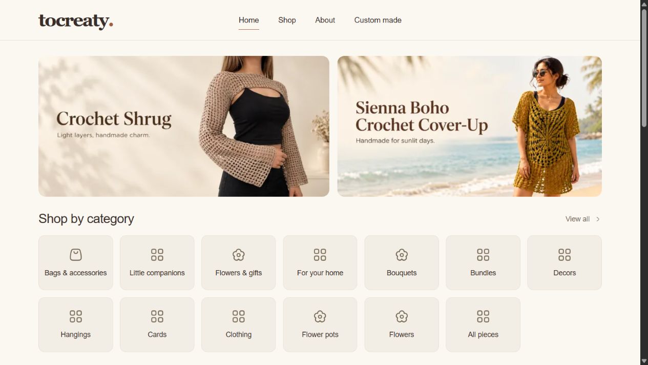
The banners use one image format across devices. More are visible on a wide screen, while a phone shows one at a time. The owner can link a banner to a product or choose the custom-order destination.
A product page that prepares an enquiry
There is no cart or payment gateway in this version. The owner wanted orders to be discussed on WhatsApp, where custom details can be agreed.
Each product has a dedicated page with a gallery, description, colour options, and space for a personalisation note. The enquiry message carries the chosen details into the conversation. Materials, size, and care information sit on the page when the owner supplies them.
The action is labelled “Enquire on WhatsApp.” It explains the next step accurately. A customer is starting a discussion, not completing a purchase.
Sharing also belongs here. Someone choosing a gift can send a product link without having to explain where to find it in the collection.
The small-screen work
The mobile layout needed a few practical corrections during the build. Extra gallery images were expanding the page. Small labels looked neat but were difficult to read. The search and sorting controls needed their own space.
I constrained the gallery so thumbnails scroll inside it, increased text sizes, and let the catalogue controls stack. The header hides when scrolling down and returns when scrolling up. Opening the menu keeps it visible.
These adjustments are easy to miss in a desktop mockup. They matter when somebody is holding a phone and trying to inspect a piece.
Make the next update manageable
The content workflow moved from a custom management panel to a standalone Sanity Studio. Products, categories, and homepage banners can be edited there.
ImageKit handles image storage. I added drag-and-drop upload fields inside Studio after the owner pointed out that switching between dashboards was cumbersome. The upload runs through a server endpoint, so the private image-storage key stays out of the Studio client.
That separation keeps the editing experience focused: choose a product, add its photographs and details, then publish it.
Giving the brand some context
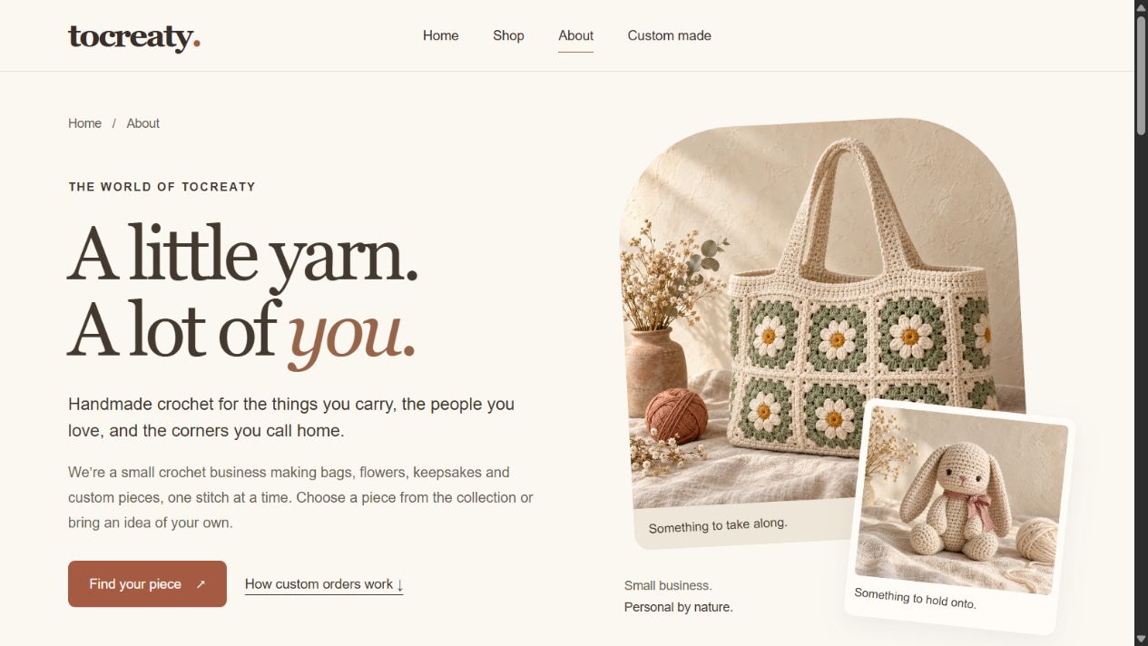
The About page explains what tocreaty makes and how custom orders work. Its collage and larger typography allow more expression than the catalogue, while the copy gives visitors a concrete idea of what to expect.
The site also includes page-specific search and sharing metadata, a sitemap, and product structured data. Published prices are included where available. Quote-only items do not receive made-up prices.
Where the project stands
The storefront and editing workflow are built. This case study records the design and implementation as the project moves through launch preparation. It does not claim a sales increase or search-ranking result.
The work brought the identity and the daily tasks closer together: browsing a piece, asking for a change, uploading the next product. That is the part of the project I would want a future client to notice.
For more detail, I wrote about carrying a warm identity into an interface, designing around a conversation, and the owner’s content workflow.
Have a business that needs its own website? Tell me about it.