
Galaxy The Global has provided vocational computing and university pathway education in Madhpara, Pakur, Jharkhand since August 15, 2006. With two decades of classroom instruction led by Director Md Alam Ali and Senior Faculty Mrs. Zeenat Parween, the institute needed a modern web home that reflected its established presence in the community without resorting to generic corporate educational clichés.
The project called for a clean, accessible frontend capable of presenting 16 distinct diploma and degree programs, guiding prospective students through course prerequisites, and making direct enquiry as effortless as possible on mobile connections.
Visit websiteA quiet palette for institutional trust
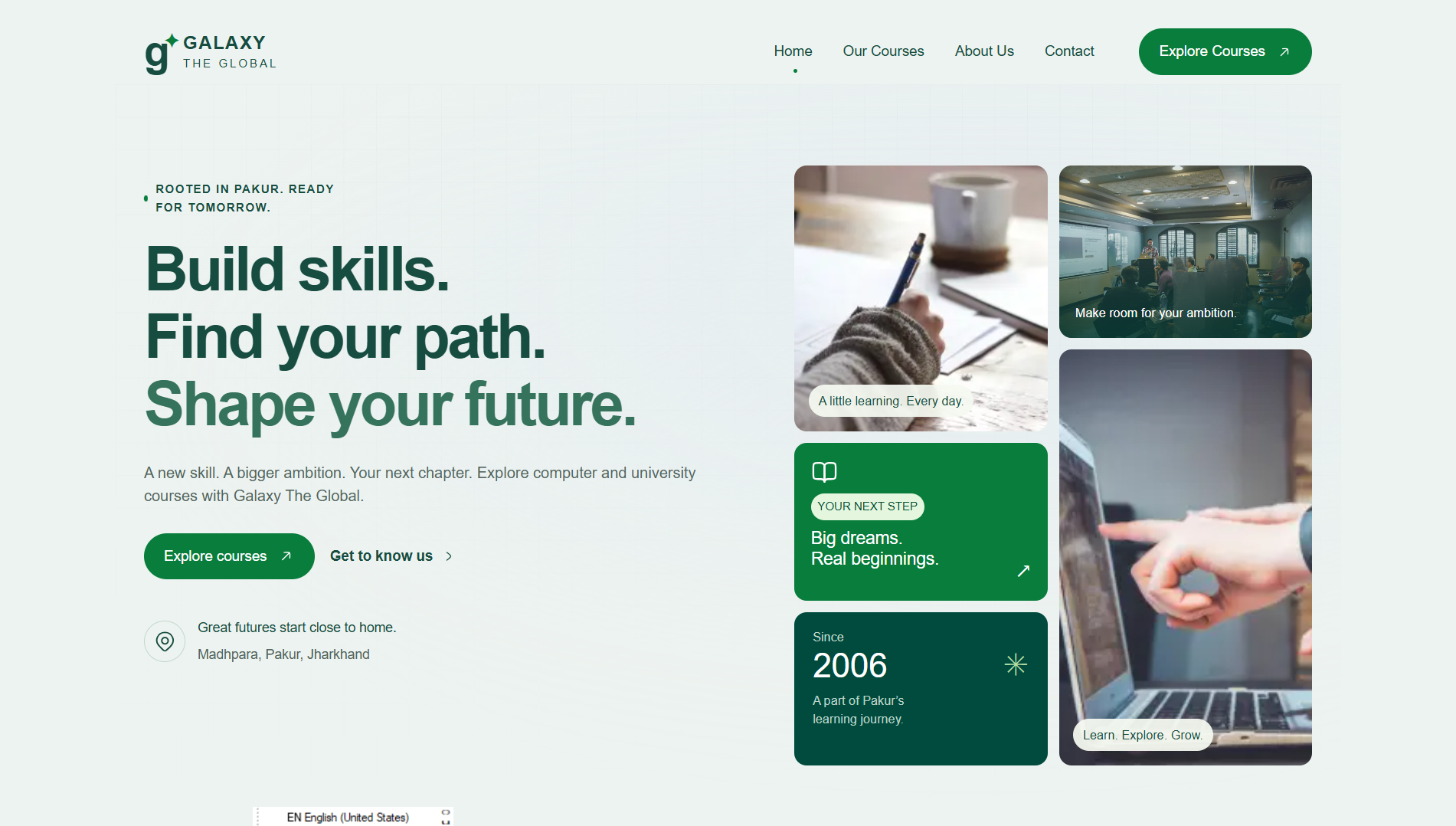
Most regional institute websites lean heavily into saturated primaries or stock corporate blues. For Galaxy The Global, we adopted an earthy, dignified green palette that feels academic and rooted: pale mint backgrounds, deep forest-green typography, and emerald action accents.
The headings use an editorial Georgia serif with weights up to 750, giving course titles and institute announcements substance and permanence. UI labels, filter pills, and syllabus listings remain in high-legibility system sans-serif.
All typography adheres to strict WCAG 2.1 AA contrast standards. White text on primary buttons was measured and specifically deepened to guarantee a contrast ratio well above 4.5:1, ensuring legibility on lower-brightness mobile screens in direct daylight.
Clarifying two academic pathways
Students arriving at the institute generally fall into two distinct groups: local school-leavers seeking foundational vocational computer literacy (such as DCA, ADCA, or accounting with Tally), and degree aspirants looking for recognized university programs (like BCA or PGDCA).
Rather than burying these choices in multi-level dropdowns, the homepage introduces both streams through dedicated visual panels right below the hero.
Each pathway card leads directly into a filtered catalogue view where visitors can browse course cards, filter by category with URL-synced tabs, or run instantaneous text searches with real-time result counts and considerate empty states.
Course details built around honest consultation
Regional education decisions are deeply consultative — parents and students discuss durations, schedules, and career value before committing.
The course detail experience was designed to provide complete transparency without overwhelming the reader:
- Illustrative Month-Wise Syllabus: Interactive single-open accordions break down course modules, practical lab hours, and weekly activities.
- Sticky Desktop Pricing & Mobile Action Bar: Desktop screens feature a clean sticky sidebar displaying duration, eligibility, and enquiry actions. On mobile, a fixed bottom enquiry bar ensures immediate contact without interrupting reading flow.
- WhatsApp Query Integration: Rather than demanding long contact forms, buttons trigger pre-populated WhatsApp messages directly to faculty numbers with course titles and student queries pre-filled.
Purpose-built mobile navigation
In Pakur and surrounding districts, almost 90% of students and families access the internet exclusively via mobile smartphones. A cramped hamburger menu with nested flyouts was unacceptable.
We engineered a full-viewport mobile navigation dialog built on native HTML modal semantics:
- Focus Containment: Keyboard and screen reader focus is strictly trapped inside the menu while open.
- Scroll Locking: Background body scrolling is locked to prevent disorienting double-scroll gestures.
- Hardware & Key Escapes: Dismisses cleanly on Escape or backdrop click, returning focus precisely to the trigger button.
- Direct Shortcuts: Prominent quick actions for direct telephone dialing, WhatsApp messaging, and locality directions.
Respecting facts: avoiding fabricated claims
A guiding principle throughout this project was content honesty. Unlike many commercial templates that ship with dummy 5-star student testimonials, fake placement guarantees, or inflated alumni statistics, this site intentionally omitted all unsupported metrics.
Until accreditation details, university affiliations, and fee structures are formally published by the administration, every course detail page explicitly notes that syllabus topics are illustrative outlines and invites direct conversation with the faculty.
Architecture and future CMS migration
The application is structured inside Next.js App Router using TypeScript, Webpack, and Tailwind CSS. All content queries are isolated behind a centralized content abstraction layer (src/lib/content.ts).
This architectural separation means that when the institute transitions from static JSON content to a headless Sanity CMS schema in phase two, the frontend views, dynamic course routes, and UI components will require zero rewrites.
Planning a website for an educational or training institute? Let's discuss your project.